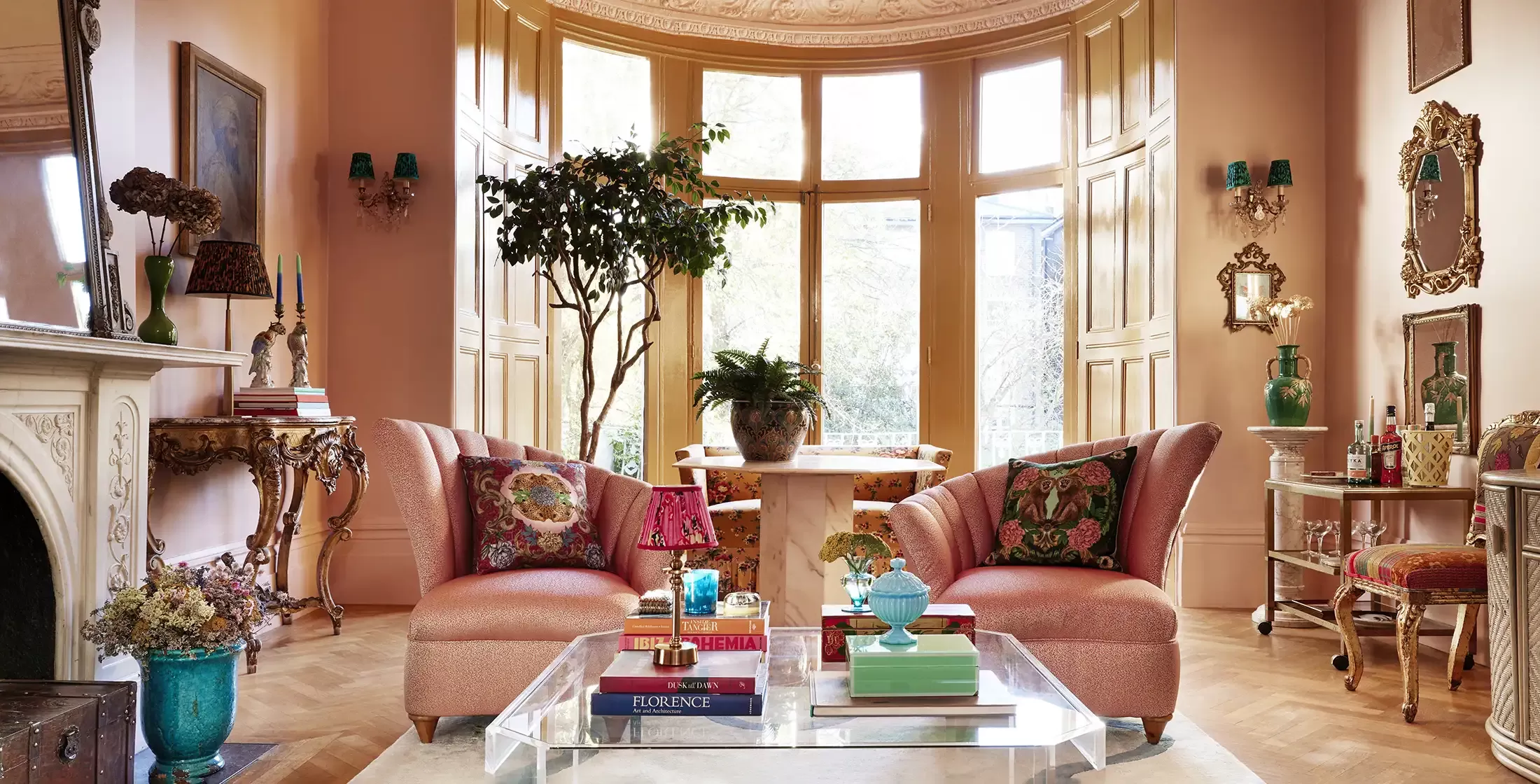
Some homes are minimalist. Some are brazenly brutalist. And then there’s Matthew Williamson’s home, which is a glorious riot of colour, textures, and patterns.
‘At heart, I’ve always been a maximalist,’ he says. ‘I’ve been forever drawn to things with a pattern, patina, or interesting texture or colour, as well as items that seem to tell a story.’
Williamson began his career as a fashion designer in the ‘90s, creating colourful pieces featured on magazine covers and worn by the likes of Kate Moss and Jade Jagger; the move to interiors came in 2010 with his first wallpaper and fabric collections. Now, his love of bright colours and flamboyant patterns has led him to the helm of Matthew Williamson Design and the moniker ‘king of maximalism’.
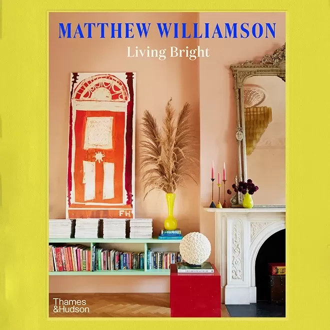
As of 7th September, he’s also added a book to his repertoire: Living Bright. Just before its release, we spoke to him about his writing process, how he styles interiors for autumn, and his top three tips for living bright – all in five questions.
Tell us about your new book, Living Bright – what inspired you to write it?
When an editor at Thames & Hudson first approached me about writing a book, I was a little unsure. Did I have a book in me? After some considerable thought and a good two years later, it seems I have.
I wanted to make a book that wouldn’t just look pretty on a coffee table but a book that would be useful and practical, a book centred around using uplifting colour in the home. It’s a subject I feel passionate about as I believe colour is the most accessible and impactful element of interior design and can go a long way to enhancing how we live. I wanted this book to show how I use colour in my home and design projects and that it’s not something to be sceptical about or fearful of.
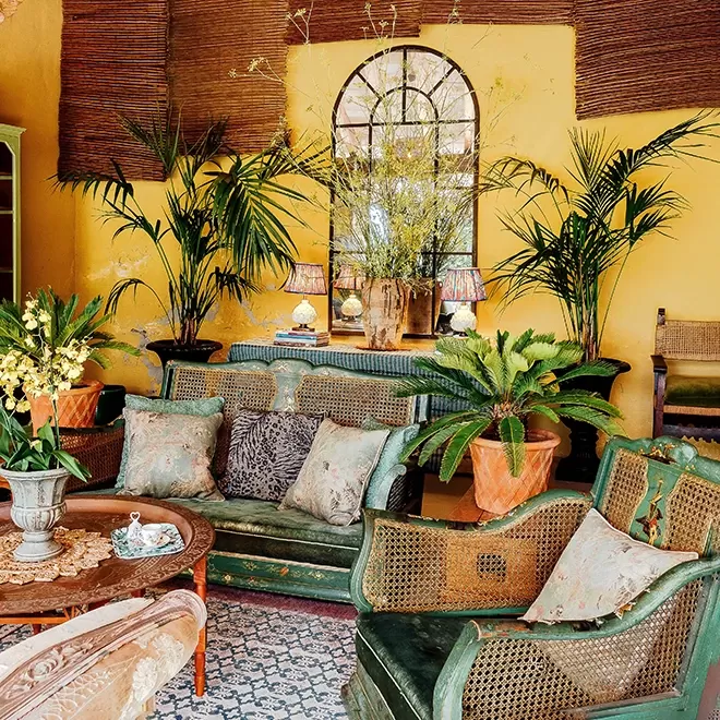
© Iaia Cocoi
Colour can be daunting if you’ve never used it before – how would you suggest starting to incorporate colour into your home?
Colour may seem daunting initially, but you will always feel comfortable if you take small steps and build on the layers of warm and cool tones. Start with something small – perhaps a bright cushion or a picture frame painted in a neon colour. If you love the result, go bigger.
I always recommend choosing colours you naturally gravitate towards that make your heart sing. Everyone has different tastes, so narrow down what it is you love. I love mixing warm and cool tones together in the same scheme, as I find in most spaces, there should be a balance of contrasting colours. And I love decorating with a sense of layering, which is incredibly important – it’s not just about bringing in bold, massive swathes of colour.


© Lynne Harkes
‘I always recommend choosing colours that you naturally gravitate towards and that make your heart sing.’
– Matthew Williamson
What do you hope readers will take away from your book?
A useful chapter called ‘Find your style’ explains how I create a personalised style and palette for a new client before beginning each project which is bespoke and unique to them. It’s a simple set of questions they answer to create their own mood board, which guides the interior design steps ahead. It’s this chapter I hope the reader will find most useful and be able to try it out for themselves.
Autumn is approaching – what colours do you find yourself drawn to at this time of the year? And how do you incorporate seasonal changes into your home?
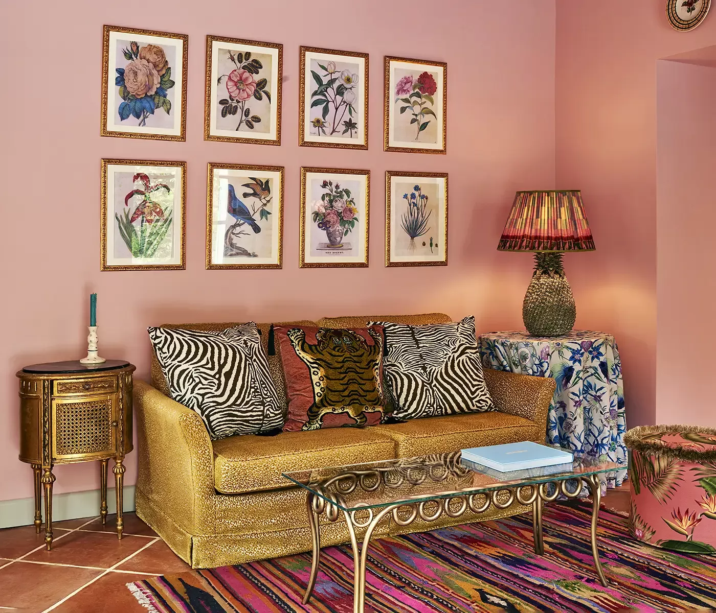
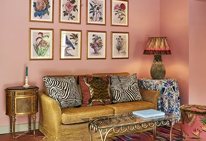
A quick refresh of each room as the seasons change can sometimes be just the tonic to see things from a new perspective and lift the spirits. I am using a soft plaster pink on the walls at home at the moment as it feels like a new neutral; it’s warmer than grey and more interesting than beige. In autumn, more generally, I also like to take massive branches from the garden, sit them in a large terracotta pot for a sculptural display, and bring out more candles, portable lamps, blankets, and throws to cosy up my home.
This autumn [in particular], I’ll invest in accessories such as velvet cushions and printed bed throws in rich chocolate, cinnamon, and burnt orange tones. I feel this palette will work well against the soft pink and add warmth to the bedroom and lounge as we hunker down and head towards winter.
Finally, can you share your top three tips from
Living Bright?
1. Trust your instincts
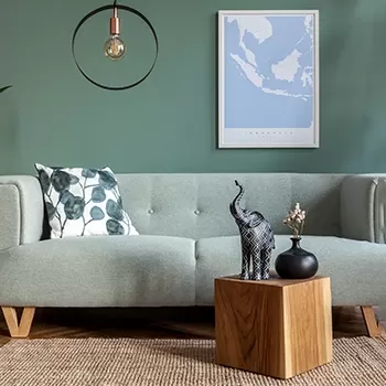
Instinct and gut play a big part for me when I’m choosing colours. I try to avoid theories and comparisons and ultimately go with colours that make my heart sing; for me, it’s often sludgy greens and soft, plaster-like pink.


2. Try something new
Remember, colour is one of the few interior design elements that can be changed quite easily, quickly, and affordably if you don’t like it. It’s not something which, once chosen, has to remain forever, so it’s well worth giving it a go and trying something new.
3. Choose a feeling, not a colour
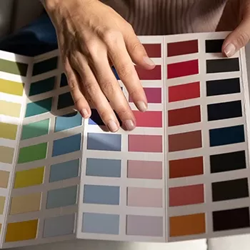
Before picking a colour, I always ask a client and myself, ‘how do you want to feel in the space?’ Once you know the answer, it will help you zone in on a particular shade. Very generally speaking, warm tones will do precisely that, add warmth and intensity to a space, and cool tones will feel colder and more expansive.

Want to stay up to date with the latest in luxury? As the world’s leading luxury concierge service, we spend time securing you access to the best of the best across the world, so you can spend more time doing the things you love. Discover more about membership here.
